A logo for the Brazilian Mountainboard Association

The Associação Brasileira de Mountainboard (ABM) needed a logo to represent the sport in Brazil. I tried a lot of ideas before getting to a badge with a rider going downhill.

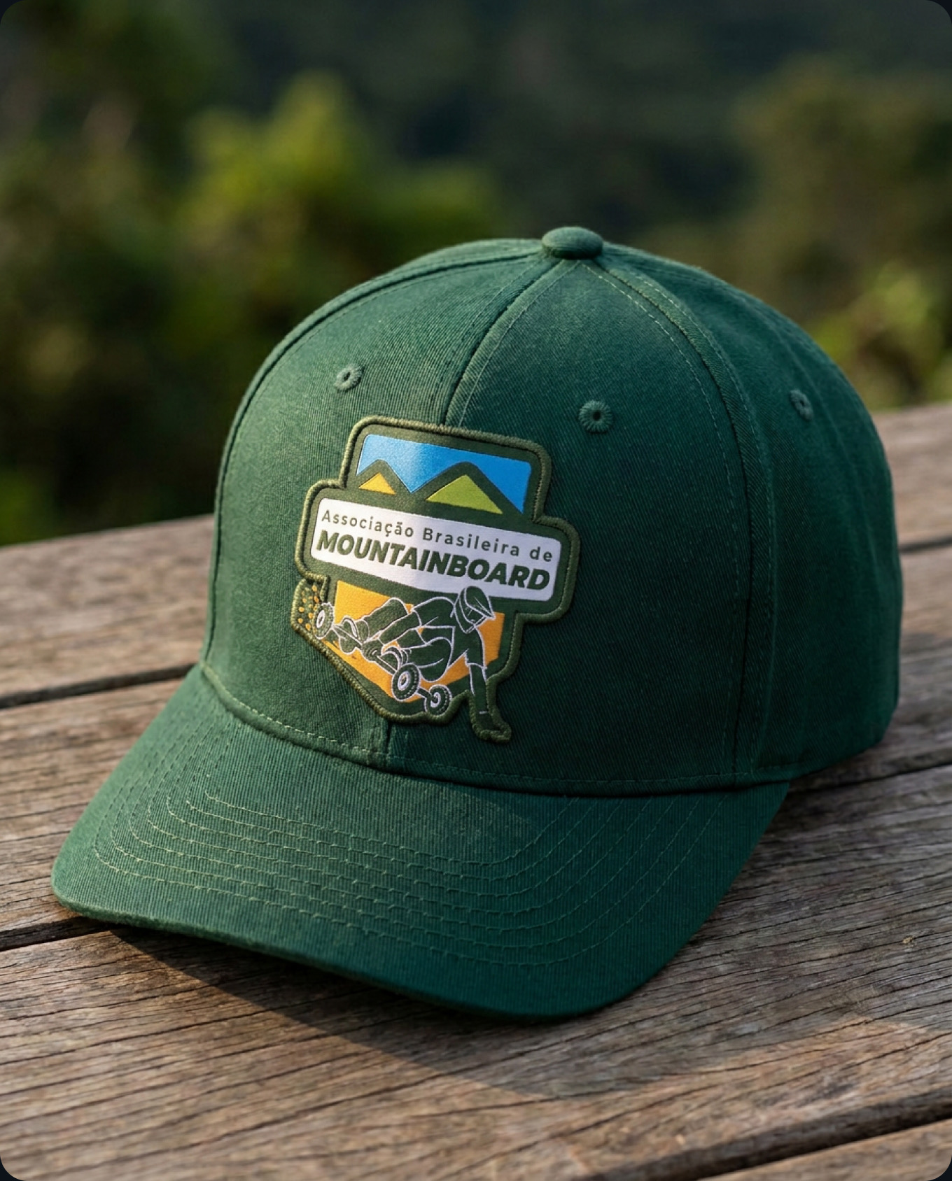
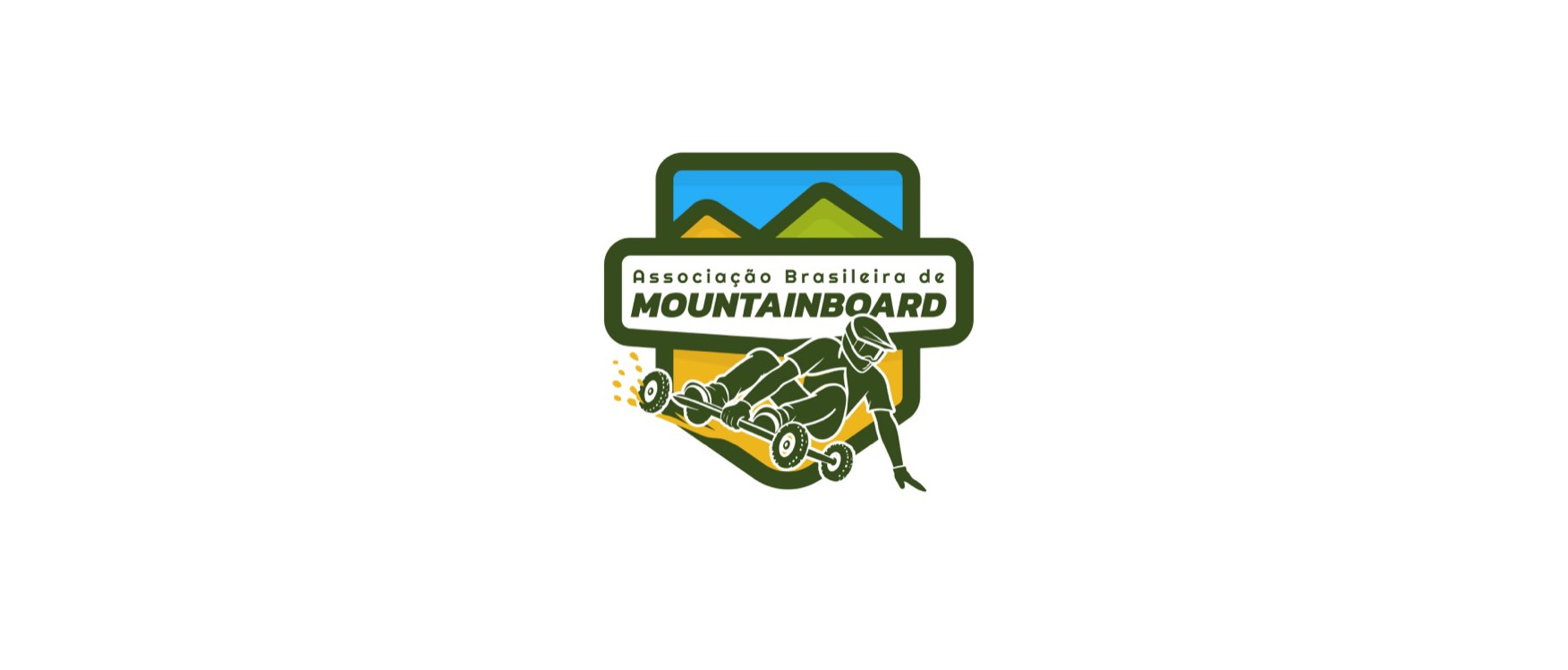
Final ABM logo: a green-outlined badge with blue sky and green and yellow mountains, the wordmark Associação Brasileira de Mountainboard across the middle, and a rider carving downhill on a mountainboard breaking out of the bottom

Looking for ideas

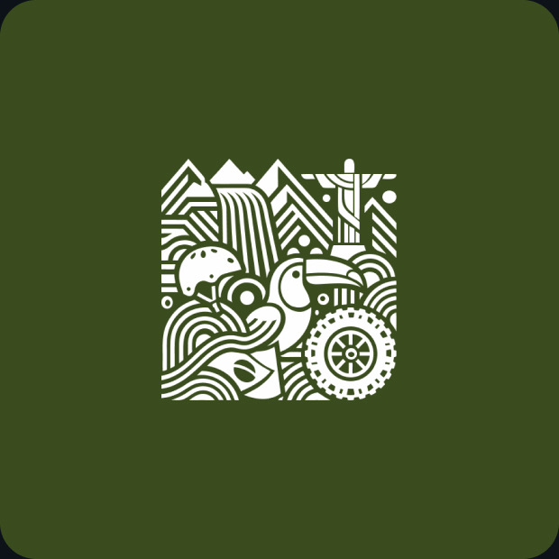
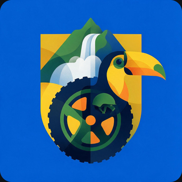
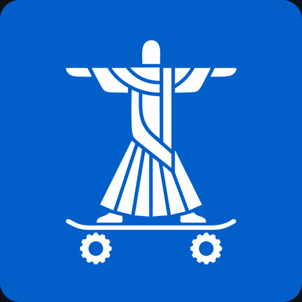
I started by putting everything on the canvas: riders, wheels, mountains, the flag, even Christ the Redeemer on a board and a toucan. I wanted to iterate with as many different concepts as possible to understand from the association directors what style to follow.

From all of that I cleaned up twelve concepts so I could compare them side by side.
Two directions

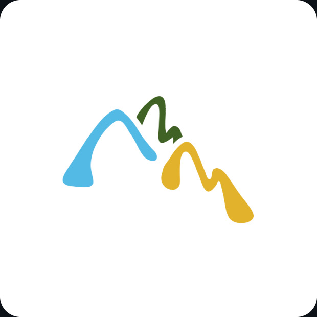
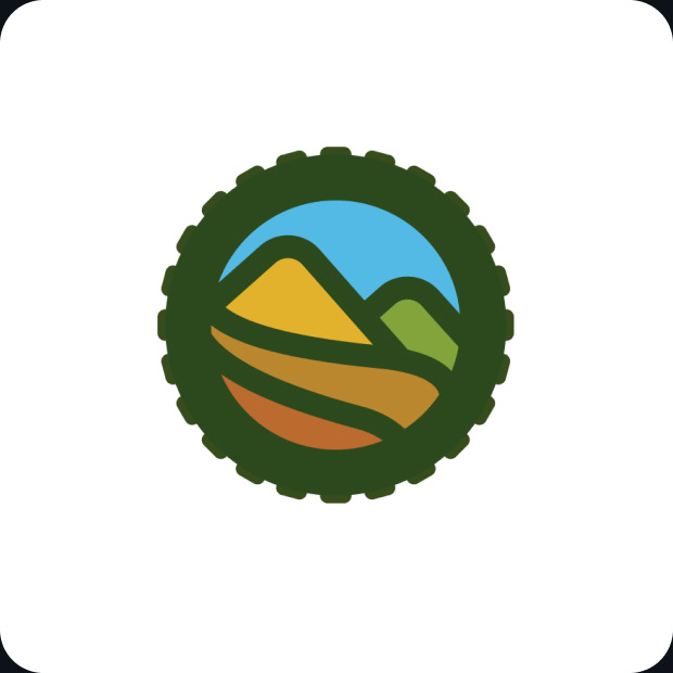
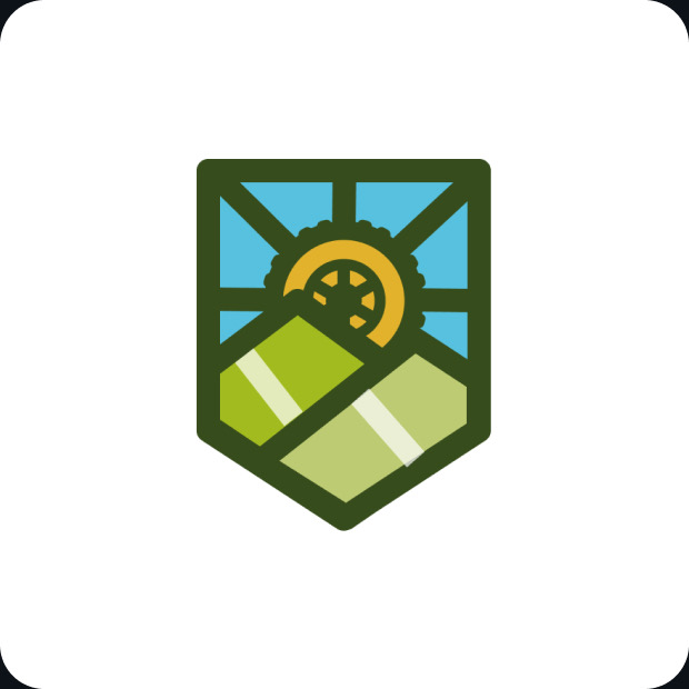
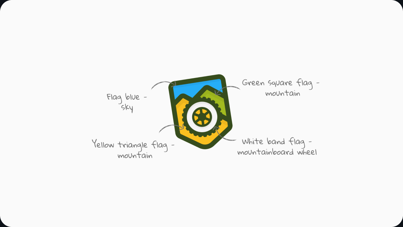
Two of them stood out. The first one was a shield made with the shapes of the Brazilian flag. The green and the yellow became mountains, the blue became the sky and the white band became a mountainboard wheel.

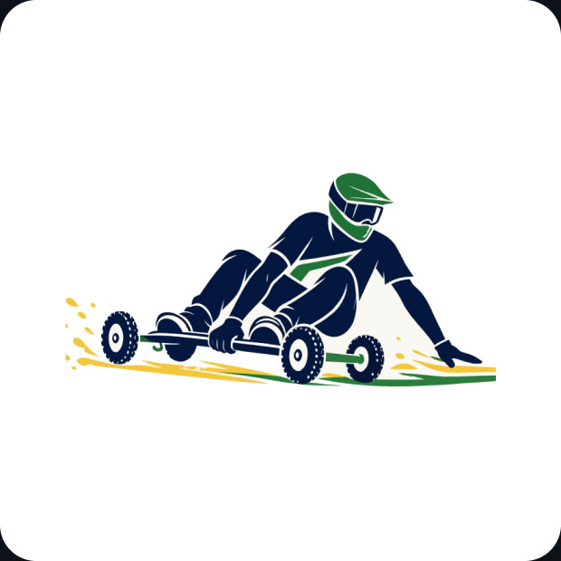
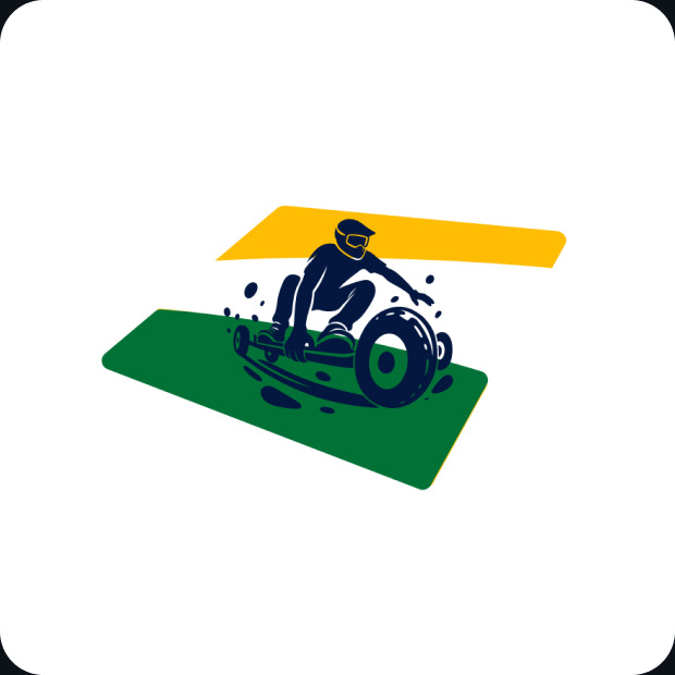
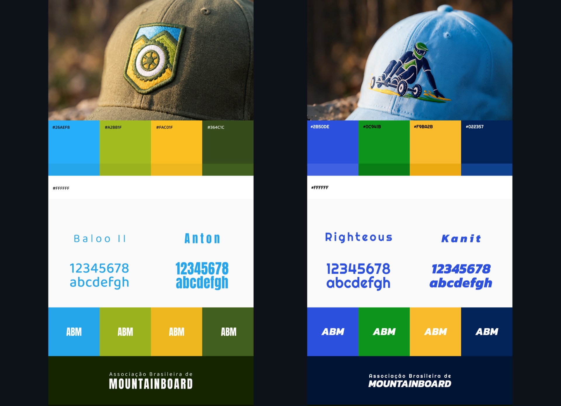
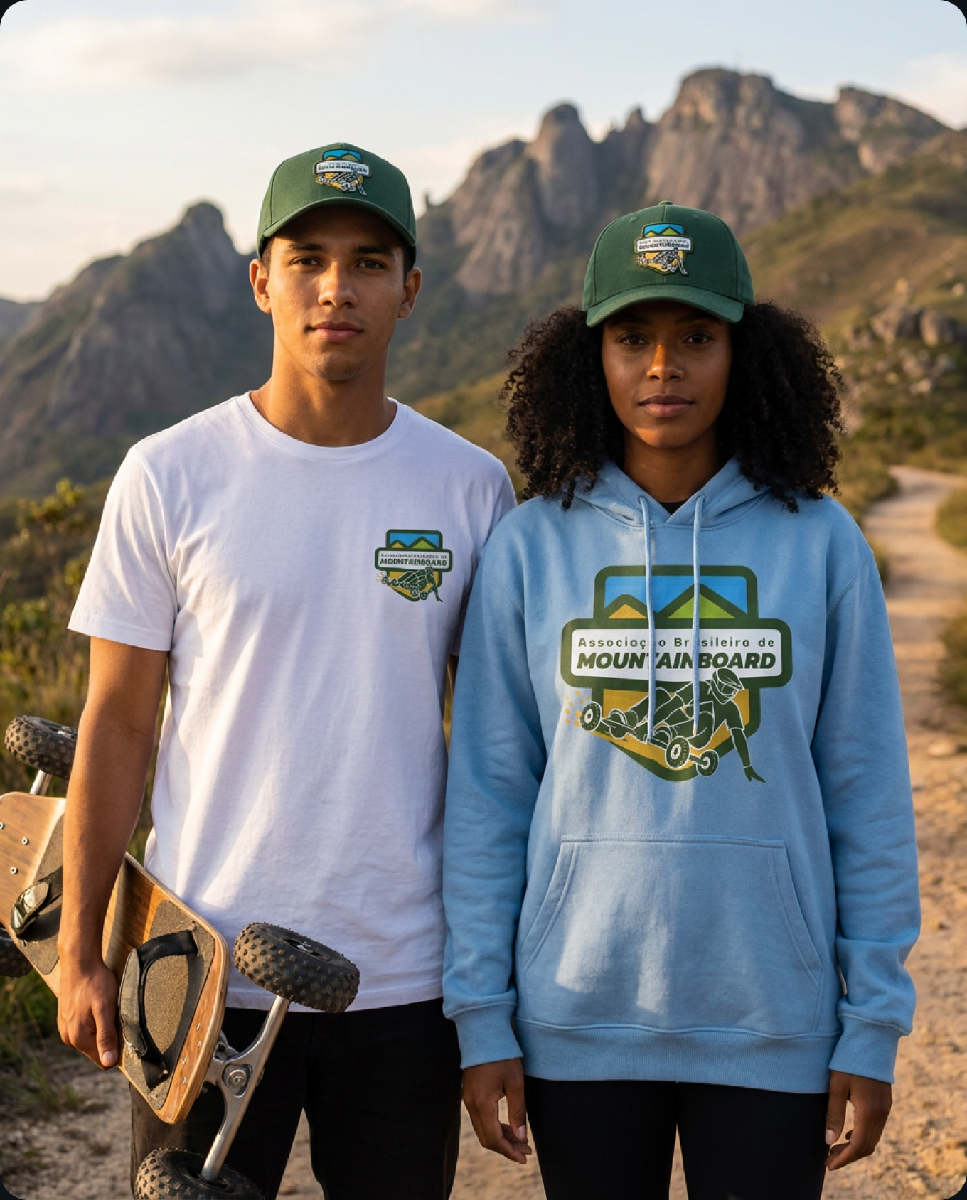
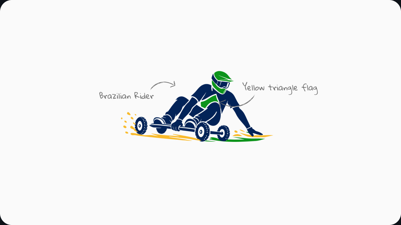
The second one was a rider going down the hill, with the colours of the flag on the helmet and on the ground. I made a full presentation for each one, with colours, fonts and how it would look on a cap, a hoodie and a letterhead.
The association's board wanted to involve the whole community in the choice of the logo so we shared both ideas with every member to get feedback through a poll.
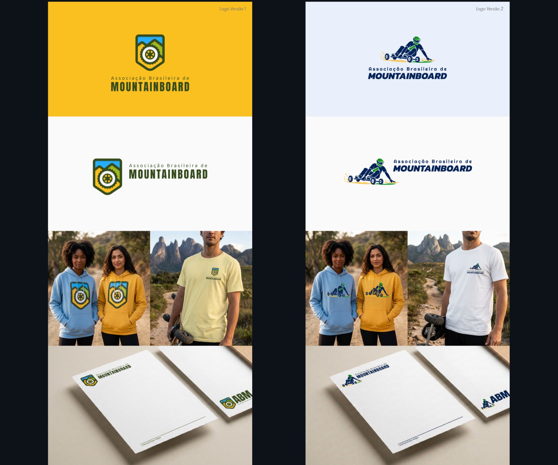
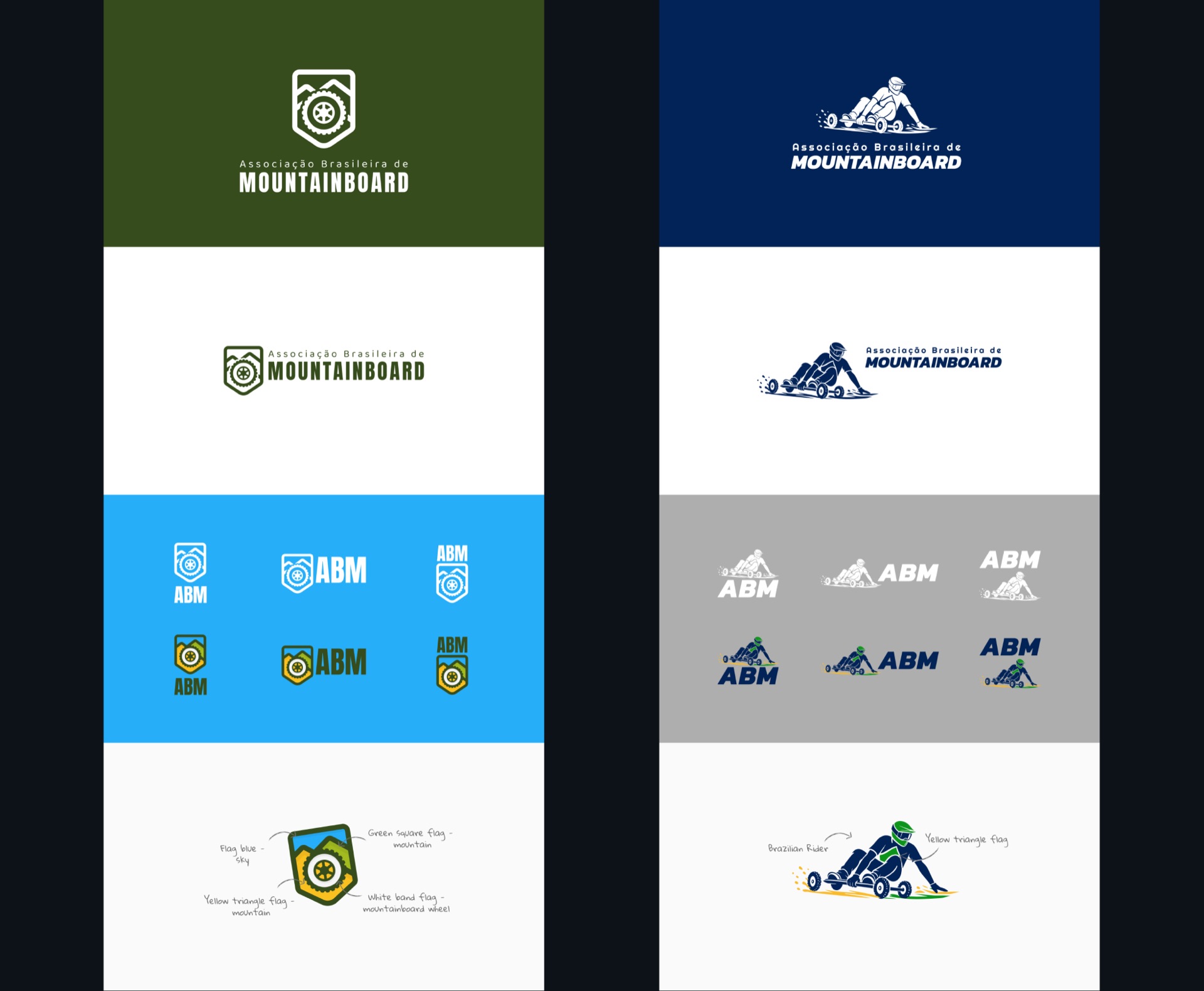
Side-by-side presentation of both versions: the logos on yellow and white backgrounds, worn on hoodies and t-shirts, and printed on letterheads
Side-by-side presentation of both versions: the logos on dark green and navy, small-size and short ABM variations, and a black-and-white application
Side-by-side presentation of both versions: each logo embroidered on a cap, the colour palettes and the typefaces for each direction

Why not both?

Both versions had something good. The shield looked like a proper badge for an association and the rider showed the sport straight away.

The poll results were really tight and people wanted to see a combination of both. So that's exactly what I did. Each logo had a different style so I used the lettering to separate them and that worked.
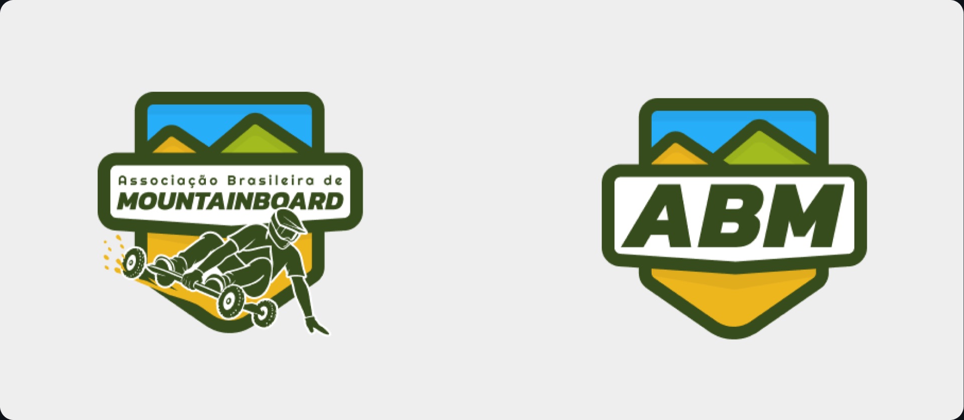
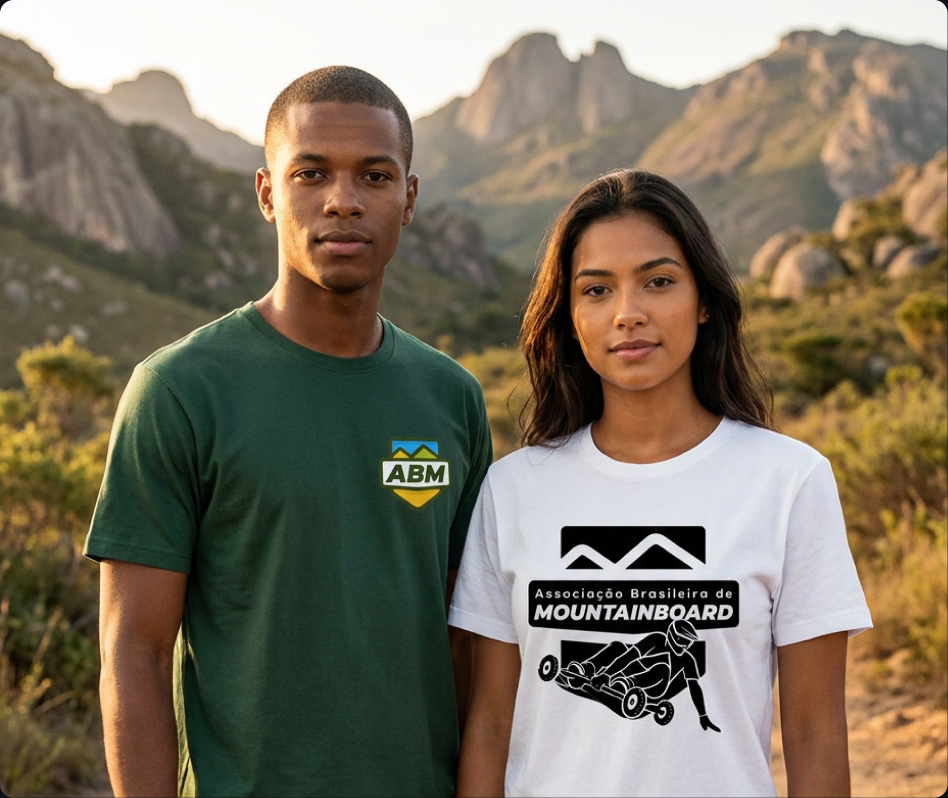
Final logo in colour next to the short ABM version: the shield with mountains, with the rider breaking out of the bottom Final logo in black and white next to the short black-and-white ABM version
Colour, black and white and the short ABM version

#logo #mountainboard #brazil #badge
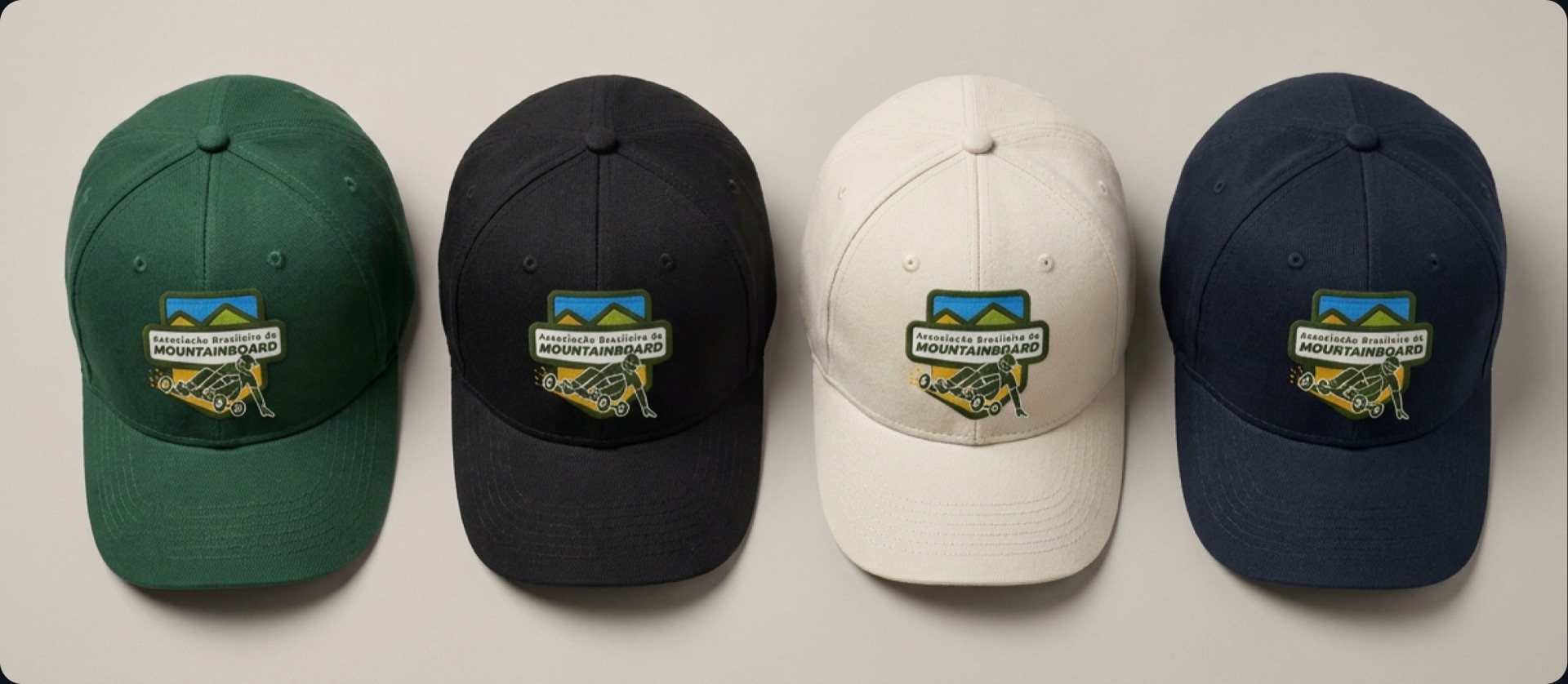
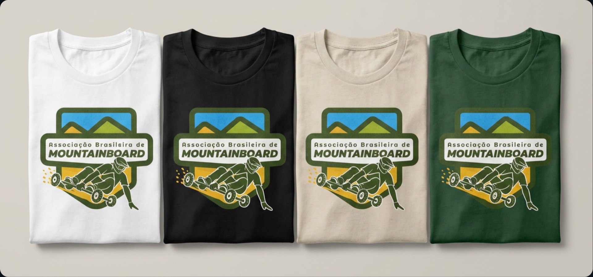
Four caps in green, black, cream and navy, each with the ABM badge on the front Two people in front of rocky mountains: one wearing a green t-shirt with the short ABM mark, the other a white t-shirt with the black-and-white logo Four folded t-shirts in white, black, cream and green, each printed with the full ABM logo